Additional Reading / Chapter Two
An artist’s thoughts on limiting color theory
A LITTLE COLOR GOES A LONG WAY
As an artist I picture places in my mind. Places I have been, but also, places only my imagination can go. I’ve been doing art for over twenty five years and drawing out my ideas in black and white is still a challenge. And honestly I would stick to black and white if I could, but people seem to like their pictures in color. Go figure.
But color is not easy. There are too many choices and a multitude of combinations. So I try to find ways to make the process easier. Or at least less painful. To begin with, or as a general rule, I limit my color palette. For most of my painting career I have limited myself to Yellow, Red, Blue, Black, White, and a couple of neutrals – Burnt Sienna and Burnt Umber. And if at all possible I’ll limit those to a single color harmonies.

Not only is a limited palette easier to manage, but it is also quicker and can leave less leftover paint on my palette to dry out. And it’s surprising how far a single color can get me. Objectively in terms or range of color, and subjectively, in the range of emotional impact and story a few tubes of paint can express.

Each of these studies are made using a combination of only three colors. Every shade, tint, and color has its purpose; they hold meaning, elicit an emotional response, and contribute to the storytelling of a picture. Combined they say even more.

three’s company
In the first picture, the foreground is painted using a generous mixture of Burnt Umber and Mars Black. Infusing the tower with an imposing sensation of scale. Ascending stairs are rendered using Titanium White, mixed with just a touch of Burnt Umber. The contrasting values provide a focus, and narrative destination for the image.
In the second image, tints and shades of Burnt Umber yield a wide range of local colors and temperatures. Establishing an atmospheric perspective and depth of field for the narrative setting.

the color makes the space
In the third image, a light foreground to a dark background presents the illusion of entering a foreboding interior space.
The color in image four suggests the reverse. Of leaving a darkened interior and entering a brighter outdoor environment.
The sepia paintings are made using Titanium White, Mars Black, and Burnt Umber. The range of local colors, shades, highlights, color temperatures, and values are infinitely surprising.
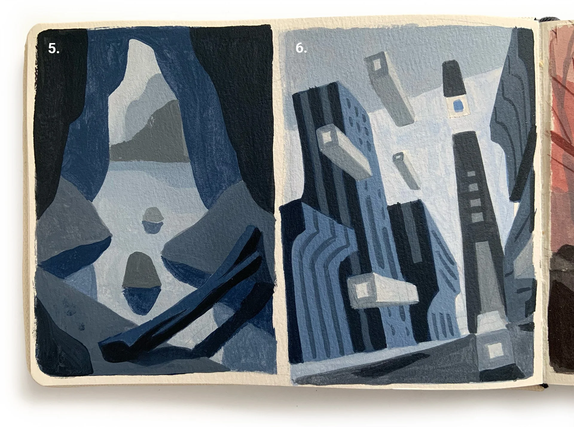
feeling blue
The next paintings demonstrate how any limited color palette can build a convincing and emotive narrative. Image five uses Ultramarine Blue, Mars Black, and Titanium White to achieve a dark interior environment and moody atmosphere. In contrast, the blue of image six establishes an industrial and technological cityscape vibe.
Monochrome color plans are the foundation of the artist’s creative process. Painting directly out of the tube can feel artificial, and hard to model convincingly. Using neutral colors to naturalize raw pigments can result in richer, and more subtle color application.

red hot
In image seven, the generous use of Cadmium Red and Mars Black creates an unsettling atmospheric tension. In image eight, the generous use of Titanium White to tint the reds and darks results in a calmer and more meditative scene.
Often I use a monochrome underpainting to form the base structure of an image. Painted over with transparent glazing to establish different local colors, while retaining as much of the underpainting as possible.
Going to Ground
The Order of Business
A traditional method of painting is to start with a limited color underpainting. It can be a flat color or a monochrome sketch of the subject to be painted . One of the first examples of this technique in western art is the Flemish painter Jan van Eyck who began with a green underpainting indicative of veins under the skin. Transparent layers of thin glazes would be overlayed to establish the details and color of flesh. Canadian painter Tom Thompson used the technique by pre-painting small boards a vibrant red brown which he would take with him to do plein air studies deep in the outdoors. His larger finished canvases also had a similar underpainting the he left uncovered between shapes in the painting . The warm color complemented the cooler greens and blues dominate in nature.

In this painting exercise I used Burnt Sienna to roughly sketch out the elements of the painting using a very thin wash. It was painted over with a minimal color palette of Ultramarine Blue, White, Black, and Burnt Siena. The colors were painted semi opaque so the underpainting would show through the thin layers of paint to give the painting a warm under glow and rich color harmony. Using just cool colors can be a little flat and look like it was painted directly out of the tube.
This technique can be replicated digitally to achieve the same color effects.
EVERYTHING OLD IS NEW
Color Separations
Before computers (I was a teenager at the time) coloring a line drawing was done during the printing process. Artists would ink or cut out stenciled overlays designating where the colors should appear. These were called color separations. As an example, a black and white line drawing of Superman would be drawn on a piece of Bristol paper. Then, the red of his trunks, cape, and boots would be inked or blocked in on a transparent overlay using a solid black. Same with the blues of his tights, and so on. This method of color separation is still done in older printing methods such as screen printing and Risographs.
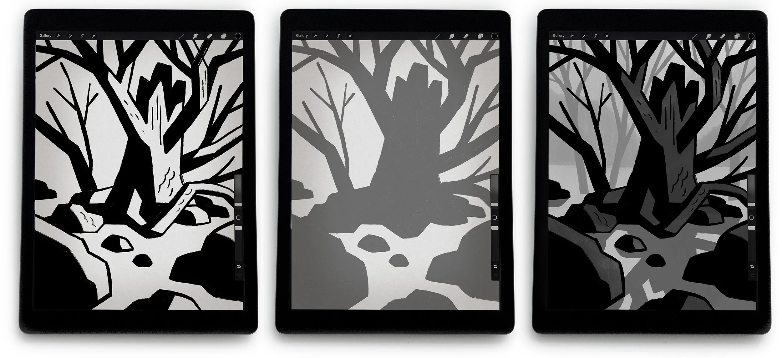
In the images shown, the artist used the fundamentals of color separations to organize his workflow. The first image (top layer) is the line drawing layer. If this was a hand drawn or scanned image, he would use multiply in the layers menu to make the white of the page transparent. The next image is a separation layer for the tree trunk, which is a layer just below the line drawing. As described earlier, the artist blocked in the shape to designate the area he wanted to color. He will also add a clip mask layer above the separation layer, so he can paint expressively inside the separated shape without worrying about coloring outside of the lines. The third image shows the foreground and background layers that further define the scene. The artist organizes his layers in folders called foreground, middle ground, and background. Arranging art layers to reflect spacial depth is intuitive and can organize the atmospheric perspective of the image.
MAPPING COLOR
Changing Color with a Press of a Button
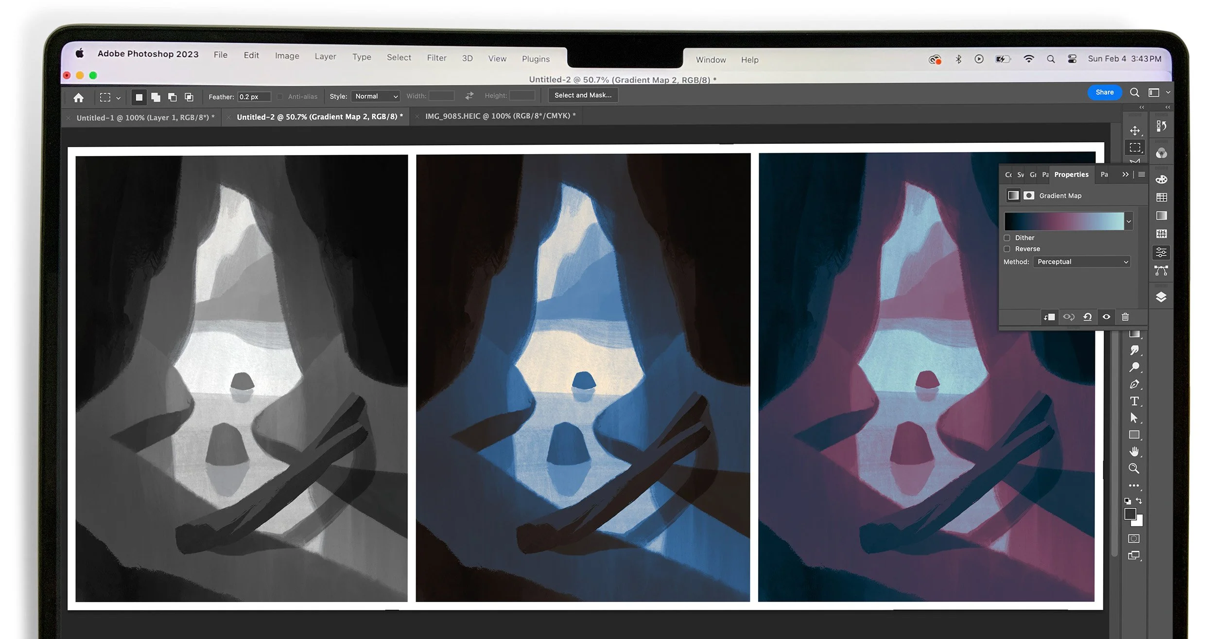
A method to further expand on color separation is using gradient maps. Gradient maps are available in many programs including Procreate and Photoshop. With gradient maps you can assign specific colors to the different values of a grayscale drawing. In the second image the artist designated the lightest values as a light tan color. For mid values he set them as blue, and the darkest values were made to be a warmer temperature black. This is a very quick method to iterate with. For example, in the third image it took only a few mouse click to reassign the lightest values to blue, the mid values to a burgundy red, and the darks to a cooler blue/black. Gradient maps can also create infinitely complex color plans. The artist can add as many color stops as he want, and as many gradient maps as he has layers to effect. He can choose individual gradient maps for specific layers, or even mask out single elements on a layer.
END OF CHAPTER TWO / Written and Illustrated by Mike Kerr ©2024


